A social media marketing strategy is a summary of everything you plan to do and hope to achieve on social media.
The more specific and concise your plan, the more effective it will be, so keep it focused enough to actually measure.
This post walks you through a seven-step plan for building a winning strategy, plus a completely free social media strategy template to download.
Key takeaways
- A social media strategy keeps your efforts intentional. Without one, you chase trends, run ads on guesswork, and post on impulse.
- Every social media strategy starts with clear goals. Every post and campaign needs a bigger purpose.
- You can’t build a strategy for everyone. Research who your audience actually is, down to age, location, and platform.
- Let the data lead. Use analytics to decide which platforms to prioritize, which content to invest in, and where your paid ad budget should go.
- Treat your strategy as a living document. Check your social performance weekly, and update the plan as platforms, audiences, and your business change.
Psst: You can also get a primer from our free ebook on social media marketing basics — grab it below. No email required!

Social media marketing is the use of platforms like Instagram, TikTok, Facebook, LinkedIn, X, YouTube, Pinterest, and others to promote your brand. Unlike traditional advertising, it’s built on two-way conversations — brands don’t just talk at people, they engage with them.
A social media marketing strategy is a plan for how you’ll use social media to reach specific business objectives. It answers questions like:
- What are our social media goals? (e.g., build brand awareness, generate leads, increase sales)
- Who are we trying to reach?
- Which platforms should we use?
- What kind of content should we post?
- How often should we post?
- Will we use paid social, organic content, or both?
- How will we measure success? And what key metrics should we track?
Without a strategy, you’re just posting for the sake of it. With one, you’re making every post, comment, and campaign count.
You should build a social media strategy so your social efforts are intentional. Without one, you chase trends with no clear purpose, run ads on guesswork, and post on impulse with no way to tell if any of it is working.
A strategy helps you:
- Turn effort into impact. Every post, campaign, and reply ladders up to bigger business objectives.
- Use time and budget more wisely. Measuring what’s working tells you which platforms to focus on, which content to invest in, and where your targeted ad budget actually pays off.
- Build trust that lasts. Showing up consistently — and with a clear brand voice — is what turns a follower into someone who actually trusts and recommends you.
- Adapt without starting over. When a platform changes its algorithm or a marketing trend fades, a strategy gives you a framework to adjust instead of starting from scratch.
- Prove your worth. You can point to specific outcomes (leads, sales, retention) when stakeholders ask how social is contributing to the business.
Think of it as your secret weapon when it comes to social media management: a good strategy sharpens your focus, amplifies your voice, and cuts through the noise.
Building an effective social media marketing strategy comes down to seven steps:
- Set goals for business success
- Know your audience deeply
- Assess your competitors’ performance
- Audit your social presence
- Find content inspiration
- Craft engaging content
- Measure and refine your strategy
Step 1. Set goals for business success
A winning social media strategy starts with clear objectives. Without them, you can’t measure ROI.
Hootsuite’s strategy doc tracks your SMART marketing goals: specific, measurable, attainable, relevant, and time-bound.
Need help getting started? We’ve got social strategy guides for small businesses, financial services, government, higher education, healthcare, real estate, law firms, and non-profits.
Track meaningful metrics
Skip vanity metrics like follower count. Instead, focus on key performance indicators (KPIs) like conversion rate or click-throughs. 69% of marketers said they prioritize these performance metrics, according to a Hootsuite survey.
Not sure where to start? If you need inspiration, take a look at these essential social media metrics.

Write down at least three goals to start, and tie each one to a business outcome so it’s easy to get leadership on board.
It’s easy to get overwhelmed by deciding what to post and which metrics to track, but you need to focus on what you want to get out of social media to begin with. Don’t just start posting and tracking everything: match your goals to your business, and your metrics to your goals.
Step 2. Know your audience deeply
Get to know your fans, followers, and potential customers as real people with real wants and needs. That’s what lets you target them effectively, whether your goal is lead generation or to build brand loyalty.
For example, Jugnoo, an Uber-like service for auto-rickshaws in India, used Facebook Analytics to learn that 90% of users who referred others were 18 to 34, and 65% of them were on Android. Targeting that exact group cut their referral costs by 40%.
Perch by Hootsuite reveals who your followers are, where they live, and how they engage. In a recent Hootsuite survey, 61% of organizations said they rely on AI-powered insights like these to help lighten the load.
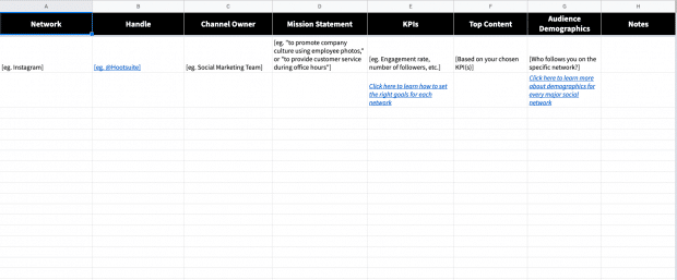
List audience demographics like age, location, and interests using our free buyer persona template, and add it to your Hootsuite strategy doc.

Check out our guide to using social media analytics and the tools you need to track them.
Step 3. Assess your competitors’ performance
Odds are your competitors are already on social media, so learn from them to sharpen your own targets. Here are a few ways to do just that:
Conduct a competitive analysis
A competitive analysis helps you understand who the competition is and what they’re doing well (and not so well). You’ll get a clear sense of what’s expected in your industry, which makes it easier to set social media targets of your own.
It also helps you spot opportunities and weaknesses worth documenting in your strategy doc.

Maybe a competitor dominates on Facebook but has put little into X (Twitter) or Instagram. That’s a signal to focus where your target audience is underserved, rather than fighting to win fans away from a dominant player.
Use social media listening
Social listening is another way to keep an eye on competitors, and it’s getting more popular: the social listening market is projected to hit $16.19 billion by 2029.
Lumen by Talkwalker tracks what your competitors are up to. Search their names, handles, and keywords to surface gaps worth exploiting — like a weak Instagram presence or a shift in sentiment.

Log these insights in your Hootsuite strategy doc to guide your next steps, but don’t overdo it: we recommend monthly checks to keep your focus.
Step 4. Audit your social presence
Before you focus on growing your online presence, audit what you’ve already got: the platforms earning engagement, and the accounts and posts that aren’t.
Hootsuite’s social media audit guide and template walks you through it, helping you spot gaps, surface opportunities, and get your profiles in fighting shape.
Review your current performance
Start with an honest look at your current performance. Which platforms are actually driving engagement and traffic? What kind of content keeps landing, and what falls flat? And are there old accounts sitting dormant, quietly doing nothing for you?
The answers tell you where to double down and where to cut your losses. If a platform isn’t delivering, either change how you’re using it or move your energy to where your audience already is.
Optimize your profiles for visibility and engagement
Social platforms are now where people search and find products.
Among Gen Z, more people discover products on Instagram (30.4%) and TikTok (23.2%) than through Google (18.8%). The same survey found that a quarter of Boomers (25.2%) most often discover new products on YouTube.
That means your profiles and content need to be optimized for social SEO. Here are some best practices:
- Make sure your bio, profile images, and contact info are up to date
- Use keywords in your descriptions for better social search visibility
- Maintain consistent brand identity across platforms
A well-optimized profile makes it easier for potential followers (and customers) to find and trust your brand.
Look for impostor accounts
If fake accounts are using your brand name, they could be confusing customers (or worse, damaging your reputation). Check for copycat accounts and report them when needed.
It’s also worth getting verified anywhere the option exists. It adds credibility and makes impersonation a lot harder. Here’s how to get verified on Facebook, X (Twitter), Instagram, TikTok, YouTube, Pinterest, and Snapchat.
A strong social presence is built, not stumbled into. By auditing and optimizing your performance on a regular basis, your strategy can stand on something solid.
Step 5. Find content inspiration
Your brand should be unmistakably yours, but that doesn’t mean starting from a blank page. Some of the best content ideas come from watching businesses that are already great on social.
Pushing creative boundaries pays off, too. In our Social Media Trends survey, 25% of respondents said most of their social content is entertainment-driven.
“I consider it my job to stay active on social: to know what’s trending, which social media campaigns are winning, what’s new with the platforms, who’s going above and beyond,” says Amanda Wood, Former Senior Manager, Social Marketing at Hootsuite.
“This might be the most fun step for you, or the hardest one, but it’s just as crucial as the rest of them,” she adds.
Social media success stories
Most social media networks publish their own (here’s Facebook’s). These case studies and testimonials can surface tactics worth borrowing for your own plan.
Award-winning accounts and campaigns
For brands operating at the top of their game, look at the winners of The Facebook Awards or The Shorty Awards.
Your favorite brands on social media
Start with the accounts you actually enjoy following. What pulls people in and gets them sharing?
For example, National Geographic is one of the best on Instagram, pairing stunning visuals with captions worth reading. (See for yourself.)

Source: National Geographic on Instagram
Nike, meanwhile, shows what great service looks like on X, using its 280 characters to announce launches and celebrate wins, but also to answer customer questions and solve problems in real time.

Source: Nike on X
What these accounts share is a consistent voice, tone, and style, so followers always know what they’re going to get. That consistency answers the only question a potential follower really has: why should I follow you, and what’s in it for me?
Consistency also helps keep your content on-brand even if you have multiple people on your social media team. For more on this, read our guide on establishing a compelling brand voice on social media.
Ask your followers
Your audience is a source of inspiration in its own right. What are your target customers talking about online, and what does that tell you about what they want?
If you’ve already got channels up and running, just ask them what they’d like to see. One catch: follow through and actually deliver, or the goodwill works against you.
Step 6. Craft engaging content
Creating great content is only half the battle. To see real results, you need to post strategically, delivering the right content to the right audience at the right time.
Plan your content mix
The best social media content strategies balance different types of posts to keep audiences engaged.
While 34% of consumers say overly self-promotional content is a major turn-off, 48% of marketers still push product news or brand updates multiple times a week. Yikes.
How do you find the balance? Try to think of your content as a mix of three general categories:
- Educate and inform. Share tips, industry insights, and thought leadership.
- Entertain. Hop on trends, use humor, or share behind-the-scenes moments.
- Promote and convert. Highlight your products, services, and customer success stories.
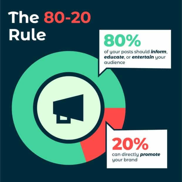
Not every post needs to be a sales pitch. Keep the 80-20 rule in mind:
- 80% of your posts should inform, educate, or entertain your audience
- 20% can directly promote your brand.
Whatever you decide on, be sure to document it in your strategy doc.

Create a content calendar
A social media content calendar helps you stay consistent without scrambling for last-minute ideas. Use yours to plan out:
- Topics and formats (videos, infographics, carousels, etc.)
- Posting frequency for each social media platform
- Key dates and campaigns to align with industry events or product launches
If you’re starting from scratch, you may not know how often to post on each network yet. Post too much and you risk annoying people; post too little and you look like you’re not worth following. Our posting frequency recommendations are a good starting point:
| Platform | Recommended posting frequency (2026) |
| 3–7 times / week | |
| 1–2 times / day | |
| Twitter (X) | 1–5 tweets / day |
| 1–5 times / day |
Perch helps you build a balanced mix and time posts around real engagement trends, so you hit the right cadence without overwhelming your followers.

Optimize for engagement
Social media isn’t just about posting, it’s about starting conversations and building real connections.
Strong captions that encourage responses, trending hashtags that boost discoverability, and interactive elements like polls, Q&As, and user-generated content all help increase engagement.
Content that invites participation, rather than just broadcasting at people, is what earns the likes, shares, and comments that expand your organic reach.
Do that consistently and you keep your audience engaged and your brand top of mind. Plan ahead, stay flexible, and keep adjusting based on what actually lands.
Step 7. Measure and refine your strategy
Your strategy isn’t set in stone. The best ones get sharper over time, refined with real data as you go, which is why it’s worth documenting your progress from the start.

Measuring ROI is a common sticking point: in HubSpot’s 2026 State of Marketing Report, 25% of marketers ranked it among their top content marketing challenges. Perch takes the guesswork out, tracking your performance and benchmarking it against your goals in a few clicks.
Look at performance metrics
Beyond the analytics built into each network, UTM parameters let you follow social visitors as they move through your site, so you can see exactly which posts are driving traffic.
Benchmark your results
You’ve got your numbers, but how do they stack up against others in your industry? Benchmarks are the fastest way to tell whether your performance is strong or just average for your category.
If Perch by Hootsuite is your management tool, its built-in benchmarking compares your accounts against the industry average.
Set custom timeframes, switch between networks (including Instagram, Facebook, X, LinkedIn, and TikTok), and pull benchmarks for metrics like follower count, audience growth rate, engagement rate, clicks, and shares.

Re-evaluate, test, and do it all again
Once the data starts coming in, use it. Revisit your techniques regularly, and put your posts, campaigns, and strategies up against each other to see what actually performs.
Constant testing is how you learn what works and what doesn’t, so you can refine the plan in real time. That’s the real point: effective social media marketing isn’t static, and your strategy should keep evolving.
Check your channels at least once a week, and once you’ve got the basics of social media reporting down, you’ll be able to track growth over time.
Pro tip 💡: With Perch, you can review every post across every network in one place. Once checking your analytics becomes routine, you can build custom reports that show specific metrics across whatever time periods you care about.

Surveys are another way to gauge how well your strategy is landing. Ask your followers, email list, and website visitors whether you’re meeting their expectations and what they’d like more of, then deliver on what they tell you.
A social media strategy is never truly final. Because social platforms, audiences, and your own business all change over time, an effective social media strategy works as a living document, one you review and update regularly.
Social media moves fast: New networks emerge, established ones shift demographics, and your business moves through its own periods of change.
Your strategy should keep pace. Refer to it often to stay on track, and update it whenever it needs to reflect new goals, tools, or plans.
Ready to start documenting? Grab your free social marketing strategy template below!

What’s next? When you’re ready to put your plan into action, we’re here to help.
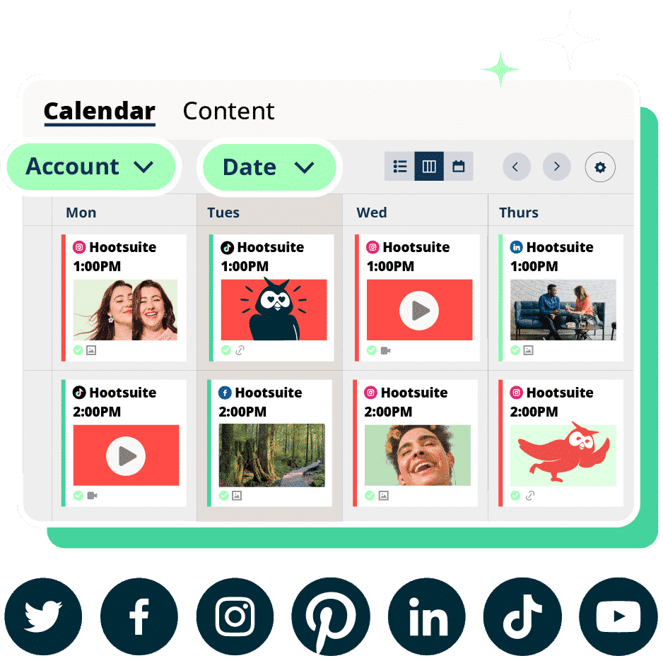
Run your whole social strategy from one place with Hootsuite Social OS. Everything social, all in one suite:
- Plan, create, and schedule content with Perch
- Track brand health, competitors, and trends with Lumen
- Manage every comment, DM, and mention from one inbox with Nest
- Rally employees to promote your brand with Parliament
- Turn social signals into answers and next steps with Wisdom
With files from Liz Stanton.